


Professional Portfolio for Michael C. Ryan
About me
I was born and raised in Vancouver, Canada where I still make my home today.
After spending many years as an independent musician writing, recording and producing my own songs, I found myself drawn to the multi-media world and web development. I am intrigued by this ever-evolving industry with its challenges both in the creative side as well as the logic side of problem solving, and attention to the details is always in my mind when at work.
Hmmmm….now all that kind of makes me sound like I’m taking myself way to seriously,yes?
Well, NOPE.
…couldn’t be farther from the truth in fact!
*insert theme from ‘The Muppet Show’ here*
I believe a large part of successfully completing a task is to maintain a constant state of humour and imagination. These can promote a productive environment without having the dreaded stress of the adult world coming in and kicking the legs out of an innovative idea. After all, an open mind is a flexible mind.
Now to answer life's burning questions:
- I like the Beatles AND the Stones
- Star Wars - because lightsabers
- Strong, black coffee with a bit of maple syrup (like a good Canadian kid)
- Dogs AND cats (they both eat spiders and this fact makes me love them as equals)
- Craft beers, big red wines, and single malt scotch should be referred to as ‘nectar’
- I’m a Mac, but I get along well with my PC friends too
- Live at the beach, but play in the mountains
Education
Emily Carr University of Art + Design – Certificate of 2D Design Basics
UBC – Certificate of Multimedia and Web Development
BCIT – Associate Certificate in Applied Web Development
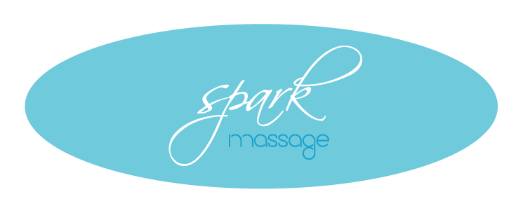
- LOGO DESIGN
A registered massage therapy clinic that also offers pilates to help with the physical rehabilitation of their clients.
I was going for a calming and personal feeling by incorporating these particular fonts and the elliptical shape for this one. The letters all seem to flow together denoting the interconnectedness of health and maintenance of a person’s body.
< Back to Portfolio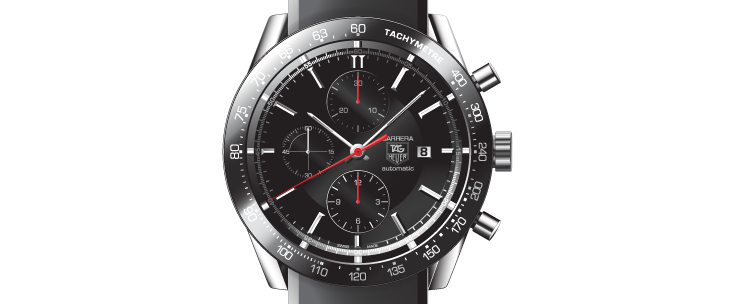
- ADOBE ILLUSTRATOR
- *VERY FIRST MAJOR PROJECT I DID IN ILLUSTRATOR*
From the first lesson I took in Illustrator I was enamored with it’s powerful capabilities and wanted to see how far I could go with them.
This assignment was to duplicate a photograph of a watch and let’s just say my OCD and attention to detail got worked over big time. :)
Depending on the project, I can work in both Illustrator and Photoshop
< Back to Portfolio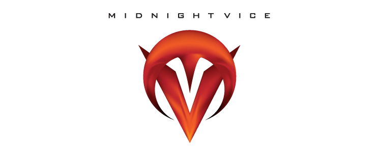
- LOGO DESIGN
A local hard rock band, they had a logo from years back that needed a fresh updating.
The ‘M’ over the ‘V’ was taken directly from the original, but I wanted to give it that iconic, rock feel while it still being easy enough to recognize or doodle onto a binder.
*Side Note: I would be remiss not to mention my personal connection with this one, as I was the lead vocalist and co-writer/producer for this band at the time.*
< Back to Portfolio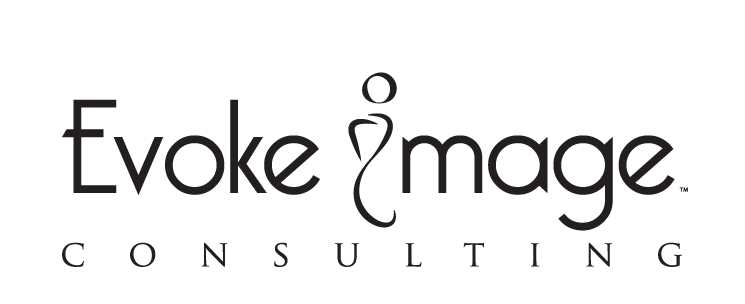
- LOGO DESIGN
- WEB SITE (Currently Inactive)
An image consulting service for people wanting to “develop a sense of self-worth” and “refreshed image” either professionally or personally.
For the logo I wanted to have something that would pop without being over-styled. As well, the contrasting ‘I’ represents the individual self set apart from the rest, and is great as a stand-alone log itself.
< Back to Portfolio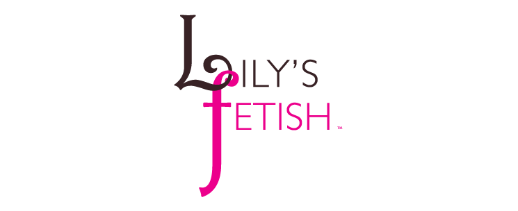
- LOGO DESIGN
This company designed and hand made light bondage collars for couples.
The subtle intertwining of the two letters worked well for describing the image, as this was not a hard-core type fetish product producer. The two connected letters also works nicely as a stand alone logo itself.
< Back to Portfolio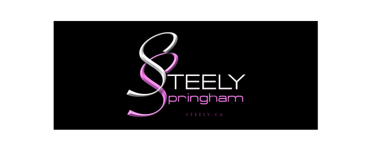
- LOGO DESIGN
An award winning figure athlete, she is also a certified personal trainer and nutrition advisor.
I wanted to show strength and femininity. Both of the ‘S’s are flowing within their script, and chiseled providing some depth.
< Back to Portfolio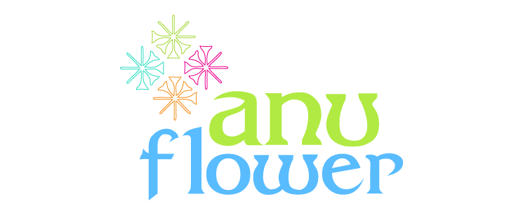
- LOGO DESIGN
This was an organic food company that produced almond flour and products baked using said flour.
Anu is one of the oldest gods in Sumerian mythology known as the ‘sky-god’, so this leant some great symbolism to be incorporated into the design. The star-like graphic within this logo is actually taken from the cuneiform for Anu. As well I thought this particular font was a good match with it's whimsical boldness it projects.
< Back to Portfolio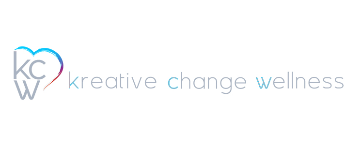
- LOGO DESIGN
- WEB SITE (Wordpress Implementation)
This site is built on the Wordpress platform.
Kreative Change Wellness is counselling service specialising in coping with grief after losing a pet. They also help in the areas of Art Therapy and Life Coaching. They requested the use of the heart symbol and wanted their logo to portray the cycle of overcoming grief.
< Back to PortfolioMichael C. Ryan | Time Equals Nothing Productions © 2024